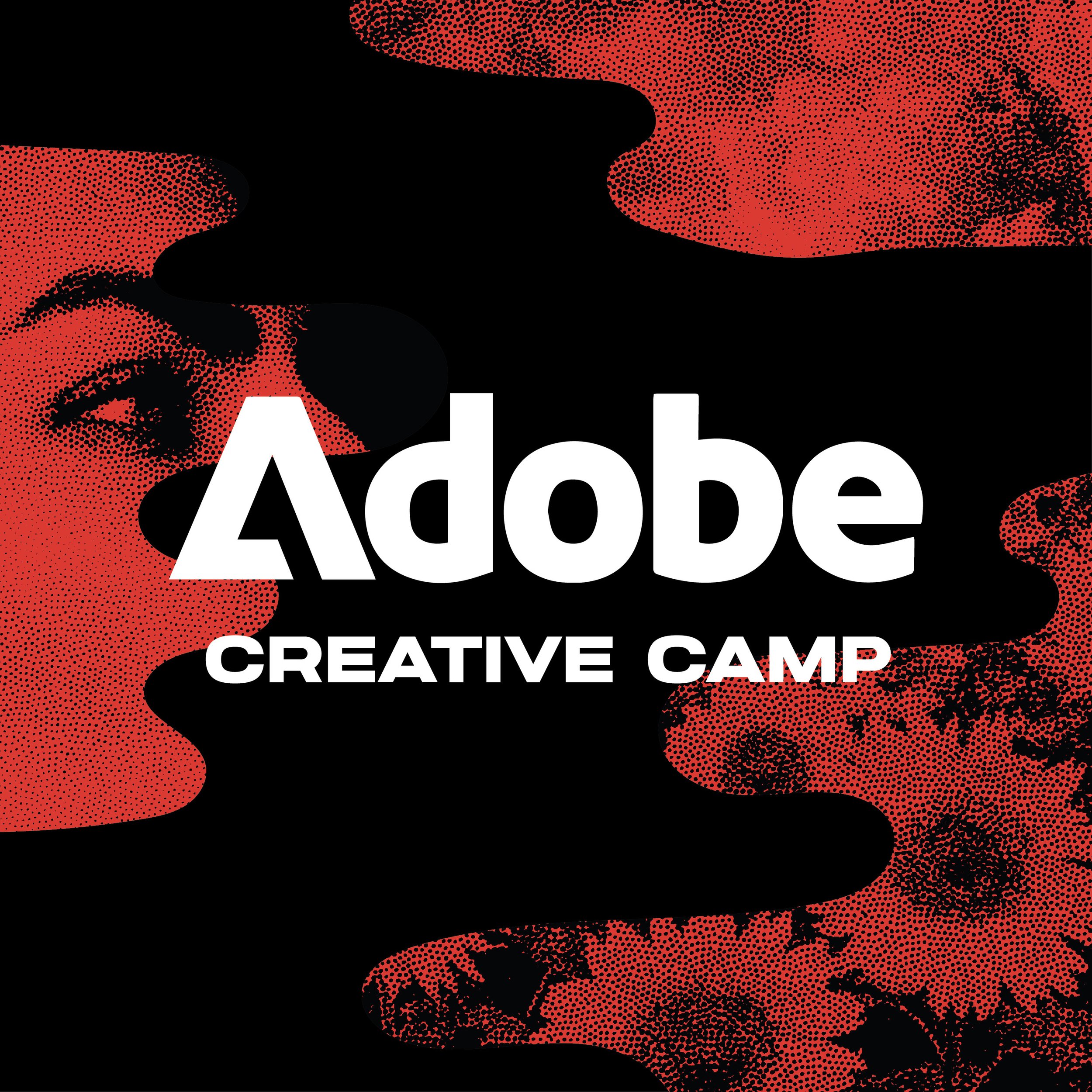
A made up event that sounds fun.
The prompt was to create environmental design for an outdoor Adobe event. Why not make it a design-centric one? The Adobe Creative Camp 2025. An outdoor conference to educate and inspire the creative professionals who use their products.

The Ingredients.
Using a color scheme inspired by Adobe’s most recent MAX Conference, “Joyride” as a secondary font, halftone imagery representing artistry, and a few fun shapes I put together, I rounded up the building blocks for the event’s branding. Eye catching design elements that can be used across a wide variety of media.
Event entrance
All of these shapes would be propped up as large signs on the ground that guests would walk by on their way into the event. They would be placed and staggered to create a full, overlapping image when viewed from a distance, but far enough apart that guests could walk through them, creating an excellent photo opportunity right from the beginning.


This is sort of what I mean.
Registration Booth
Here we’re starting to incorporate more of those shapes in the branding. More halftone images, use of the color-scheme gradient, and the geometric shapes.


Photo Opportunity
Leaning a little more into the color scheme, these could be placed inside the event where foot traffic is heavy to give guests another excellent backdrop for photos. Smaller versions of the individual posters could be printed and sold/distributed as keepsakes from the event.


